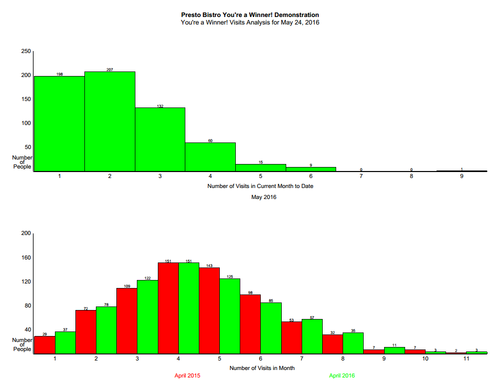
This page shows two graphs. The top graph shows the number of visits in the current month up to the moment the analysis is run. The height of each bar shows the number of individuals who have visited and (re-)entered the draw in the month. The bars represent the frequency. In this sample 198 people have visited the facility once in the month of May 2016, 207 people visited twice, 132 people visited 3 times and so on.
The second graph shows the number of visits by individuals in the most recent complete month (April 2016, in green) and compares those numbers with the same month from the prior year (April 2015, in red). In this chart you can see that 29 people visited the facility one time during the month of April 2015 (green column) compared to 37 people who visited the facility in April 2016, 72 (red column) people visited the facility two times in April 2015 compared with 78 people (green column), and so on.